@internationalized/date. All variants share one Alpine component (flex-date-time-field), one Blade view, and the InteractsWithDateTimeConfiguration trait.
Summary
| Component | Class | Mode | Calendar | Typical state |
|---|---|---|---|---|
| FlexDateField | FlexDateField | date | No | string — e.g. 2026-06-15 |
| FlexDatePicker | FlexDatePicker | date | Yes (popover) | string — e.g. 2026-06-15 |
| FlexTimeField | FlexTimeField | time | No | string — e.g. 14:30:00 |
| FlexTimeSegmentsField | FlexTimeSegmentsField | — | No (dropdown) | string — e.g. 09:30 (HH:MM, 24h) |
| ScheduleField | ScheduleField | — | No (embedded) | array — weekly schedule with timezone, days, slots — see schedule-field.md |
| FlexDateTimePicker | FlexDateTimePicker | dateTime | Yes (popover) | string — e.g. 2026-06-15T14:30:00 |
| FlexDateRangeField | FlexDateRangeField | dateRange | Yes (range UI) | array<start: string|null, end: string|null> |
| FlexDurationField | FlexDurationField | duration | No | string — e.g. 02:30:00 |
| FlexTimeRangeField | FlexTimeRangeField | timeRange | No | array<start: string|null, end: string|null> |
| FlexMonthPicker | FlexMonthPicker | month | Yes (month grid) | string — e.g. 2026-06 |
| FlexYearPicker | FlexYearPicker | year | Yes (year grid) | string — e.g. 2026 |
| Base class | Bjanczak\FilamentFlexFields\Filament\Forms\Components\FlexDateTimeField (abstract) |
| Granularity enum | Bjanczak\FilamentFlexFields\Enums\DateTimeGranularity — Day, Hour, Minute, Second |
| Month display enum | Bjanczak\FilamentFlexFields\Enums\MonthDisplay — Numeric, Short, Long |
FlexField FieldType | date → FlexDatePicker, time → FlexTimeField, date_time → FlexDateTimePicker, date_range → FlexDateRangeField, duration → FlexDurationField, time_range → FlexTimeRangeField, month → FlexMonthPicker, year → FlexYearPicker, timezone → TimezoneField |
FlexFieldFormBuilder::configureDateTimeField() applies JSON config keys (granularity, hour_cycle, show_seconds, min_value/min_date, max_value/max_date, display_format, storage_format, locale, time_zone, force_leading_zeros, hide_time_zone, hide_time_section, close_on_select, allow_same_day, range_separator, variant, size, first_day_of_week, unavailable_dates, show_year_segment, month_display) to all date/time field types.
Use FlexDateField::make() explicitly when you need segmented date input without a calendar popover.
Basic usage
FlexDateField — segmented date, no calendar
FlexDatePicker — segmented date with calendar popover
FlexTimeField — segmented time (12h or 24h)
FlexTimeSegmentsField — dropdown hour / minute (24h)
Use when you need a compact dropdown time control (two scroll columns) instead of segmented text input — e.g. schedule slots, opening hours. Shares the flex-text-input shell (variant, size) but not the full FlexTextInput API (no prefix/suffix, masks, dictation, etc.).
State is always normalized to HH:MM (24-hour). Configure minute granularity with minuteStep() (default 15).
time_picker: dropdown or segments):
time_picker is segmented (FlexTimeField).
FlexDateTimePicker — date + time with calendar
FlexDateRangeField — start/end range with optional time under calendar
FlexMonthPicker — month + year with calendar
Calendar opens on the years grid; pick a year, then the months grid.FlexMonthPicker — month only (no year segment)
Y-m (e.g. 2026-06); when the year segment is hidden, the current calendar year is used when composing the stored value.
FlexYearPicker — year with calendar
Full form example
State format
Values are normalized on hydrate and dehydrate viaDateTimeFieldValue and the configured storageFormat().
Single value fields (FlexDateField, FlexDatePicker, FlexTimeField, FlexDateTimePicker)
| Mode | Default storage format | Example stored value |
|---|---|---|
| Date | Y-m-d | 2026-06-15 |
| Time | H:i (or H:i:s with showSeconds()) | 14:30 / 14:30:00 |
| DateTime — Hour | Y-m-d\TH:00:00 | 2026-06-15T14:00:00 |
| DateTime — Minute | Y-m-d\TH:i:00 | 2026-06-15T14:30:00 |
| DateTime — Second | Y-m-d\TH:i:s | 2026-06-15T14:30:45 |
Month (FlexMonthPicker) | Y-m | 2026-06 |
Year (FlexYearPicker) | Y | 2026 |
normalizeState() accepts strings, numeric strings, and CarbonInterface instances. Invalid values become null and fail validation when the field is required or non-empty.
For FlexMonthPicker with showYearSegment(false), storage format remains Y-m; the year defaults to the current calendar year when only the month segment is filled.
Range field (FlexDateRangeField)
granularity is Day, start/end are date-only strings (Y-m-d). With time granularity, ISO-like datetime strings are used (see defaults above).
Display format vs storage format
UsedisplayFormat() for how values are formatted for display helpers / SSR initialDisplay, and storageFormat() for what is persisted in form state and the database.
DateTimeLocaleOrder (PHP IntlDateFormatter + JS Intl). Examples:
| Locale | Date segment order | Example |
|---|---|---|
pl_PL, en_GB, de_DE | day-first | dd · mm · yyyy |
en_US | month-first | mm · dd · yyyy |
pl_PL are normalized to BCP 47 (pl-PL) for Intl in JS calendar labels and month display.
displayFormat() affects server-side display helpers only (initialDisplay, formatForDisplay) — it does not change segment order in the UI.
Granularity and time precision
granularity() controls which time segments appear and how values are stored.
DateTimeGranularity | Date segments | Time segments | Use case |
|---|---|---|---|
Day | month, day, year | — | Date only |
Hour | month, day, year | hour | Date + hour |
Minute | month, day, year | hour, minute | Date + hour:minute (default for DateTime) |
Second | month, day, year | hour, minute, second | Full precision |
granularity is not Day and hideTimeSection() is false, time rows appear under the calendar popover (start/end time segments).
For date/time picker, when time is enabled, a single Time row appears under the calendar for editing hour/minute/second without closing the popover (closeOnSelect(false) in recommended defaults).
Validation
Built-in validation runs through a customrule() on FlexDateTimeField. Filament’s default required rule is overridden to nullable — emptiness and constraints are handled by the custom rule.
| Check | When | Message key |
|---|---|---|
| Required | required() and empty state | validation.required |
| Invalid / unparsable | normalizeState() returns null | date_time.validation.invalid |
| Below minimum | minValue() | date_time.validation.before_min |
| Above maximum | maxValue() | date_time.validation.after_max |
| Unavailable date | isDateUnavailable() callback | date_time.validation.unavailable |
| Incomplete range | Missing start or end | date_time.validation.incomplete_range |
| Range order | end before start | date_time.validation.range_order |
| Same day | allowSameDay(false) and equal dates | date_time.validation.same_day_not_allowed |
minValue / maxValue are disabled. isDateUnavailable() is validated on submit but unavailable days are not yet disabled in the calendar UI.
On segment blur, client-side validation sets segmentInvalid when segments are incomplete or out of bounds. The message appears below the input shell (.fff-date-time-field__segment-error, role="alert"), not inside individual segments. Text comes from config.segmentInvalidMessage / translation key date_time.validation.invalid. Server-side validation (form submit) is unchanged.
Preset bundle: withRecommendedDefaults()
Applies sensible defaults per mode:
| Mode | Preset |
|---|---|
| Date | granularity(Day), closeOnSelect(), highlightToday() |
| Time | granularity(Minute), hourCycle(12), hideTimeZone() |
| DateTime | granularity(Minute), hourCycle(24), closeOnSelect(false) |
| DateRange | granularity(Day), allowSameDay(), highlightToday(), closeOnSelect(false) |
| Month | closeOnSelect(), highlightToday() |
| Year | closeOnSelect(), highlightToday() |
Configuration API
All date/time components share these chainable methods (fromInteractsWithDateTimeConfiguration + HasControlSize + HasFieldFocusOutline).
variant(string|Closure $variant)
Visual shell style. Values: primary (default), secondary, flat. Shared with FlexTextInput tokens.
size(string|ControlSize|Closure $size)
Control height. See Control size. Default: md.
granularity(DateTimeGranularity|string|Closure $granularity)
Time precision. Default: Day for date/range date-only; use Minute or Second for datetime/time. See Granularity and time precision.
locale(string|Closure|null $locale)
BCP 47 locale for segment order, placeholders, separators, and calendar labels. Default: app()->getLocale(). Laravel-style tags (pl_PL) are normalized to BCP 47 (pl-PL) for JS Intl APIs. Segment order follows locale via DateTimeLocaleOrder — see Display format vs storage format.
timeZone(string|Closure|null $timeZone)
IANA timezone identifier passed to Alpine (config.timeZone). Default: config('app.timezone'). Affects calendar “today” and datetime parsing context.
hourCycle(int|Closure $hourCycle)
12 or 24. 12 adds an AM/PM (dayPeriod) segment on time and datetime fields. Invalid values throw InvalidArgumentException.
displayFormat(string|Closure|null $format)
PHP date format for display helpers (initialDisplay, formatForDisplay). When omitted, mode-specific defaults apply (e.g. m/d/Y, m/d/Y H:i:s). Does not affect segment order — that is driven by locale(). See Display format vs storage format.
storageFormat(string|Closure|null $format)
Format used when normalizing state for storage. When omitted, mode/granularity defaults apply. See State format.
forceLeadingZeros(bool|Closure $condition = true)
Pad segment values with leading zeros (06 vs 6). Default: true.
showYearSegment(bool|Closure $condition = true)
Default: true. When false, only the month segment is shown (no year segment). Used by FlexMonthPicker for month-only fields. Storage format remains Y-m; the current calendar year is used when composing the stored value from a month-only segment.
monthDisplay(MonthDisplay|string|Closure $display)
Controls how the month segment is rendered. Enum Bjanczak\FilamentFlexFields\Enums\MonthDisplay:
| Value | Segment display | Example (pl_PL) |
|---|---|---|
Numeric (default) | zero-padded number | 06 |
Short | abbreviated name | cze |
Long | full name | czerwiec |
field-sizing: content); CSS variable --fff-date-time-month-ch sets character width. The calendar month grid always uses short month labels regardless of monthDisplay().
minValue(string|CarbonInterface|Closure|null $value)
Minimum allowed value. Accepts date/time strings or Carbon instances. Enforced on submit; calendar disables earlier days (date portion).
minValue()):
maxValue(string|CarbonInterface|Closure|null $value)
Maximum allowed value. Same types as minValue().
maxValue()):
Example: date of birth bounds
isDateUnavailable(Closure $callback)
Mark specific dates as invalid. Callback receives Carbon at start of day; return true to reject.
rangeSeparator(string|Closure $separator)
Text between start and end segments in range fields. Default: ' - '.
allowSameDay(bool|Closure $condition = true)
Whether start and end can be the same calendar day in range mode. Default: true. FlexDateRangeField recommended preset keeps true; set false for multi-day-only ranges.
highlightToday(bool|Closure $condition = true)
Show a dot on today’s date in the calendar. Default: true.
showCalendar(bool|Closure $condition) / showCalendarButton(bool|Closure $condition)
Enable calendar popover and trailing calendar trigger button. Set automatically per component class (FlexDatePicker, FlexDateTimePicker, FlexDateRangeField, FlexMonthPicker, FlexYearPicker = on; FlexDateField, FlexTimeField = off).
closeOnSelect(bool|Closure $condition = true)
Close calendar popover after selecting a date. Default: true for date picker, false for date/time and range (recommended) so users can adjust time under the calendar.
firstDayOfWeek(int|Closure $day)
Week start for calendar grid. 0 = Sunday, 1 = Monday, … 6 = Saturday. Default: 0.
hideTimeZone(bool|Closure $condition = true)
Hide timezone label segment on time-only fields. Default: false; recommended time preset enables it.
hideTimeSection(bool|Closure $condition = true)
Hide time rows under the calendar (range / date-time). When hidden, only date segments are used in the main input.
showSeconds(bool|Closure $condition = true)
Include second segment on time/datetime fields. Implied when granularity(Second).
withRecommendedDefaults()
Mode-specific preset bundle. See Preset bundle.
focusOutline(bool|Closure $condition = true)
Inherited from HasFieldFocusOutline. Show focus ring on the outer shell.
Inherited Filament Field API
label(), helperText(), hint(), placeholder(), required(), disabled(), readOnly(), default(), live(), dehydrated(), hidden(), visible(), rule(), rules(), afterStateUpdated() — all work as usual. See Inherited Filament field API.
Default placeholders (translation keys under filament-flex-fields::default.date_time):
| Mode | Key |
|---|---|
| Date | placeholder_date |
| Time | placeholder_time |
| DateTime | placeholder_date_time |
| DateRange | placeholder_date_range |
Recipe examples
Booking form with bounds and blocked weekends
Event scheduling with 12-hour clock and seconds
EU display, ISO storage
Dynamic min date from another field (Closure)
Read-only review field
Custom validation rule alongside built-in
Hydrate from Eloquent datetime cast
Store only date in MySQL DATE column
Range with per-day time windows under calendar
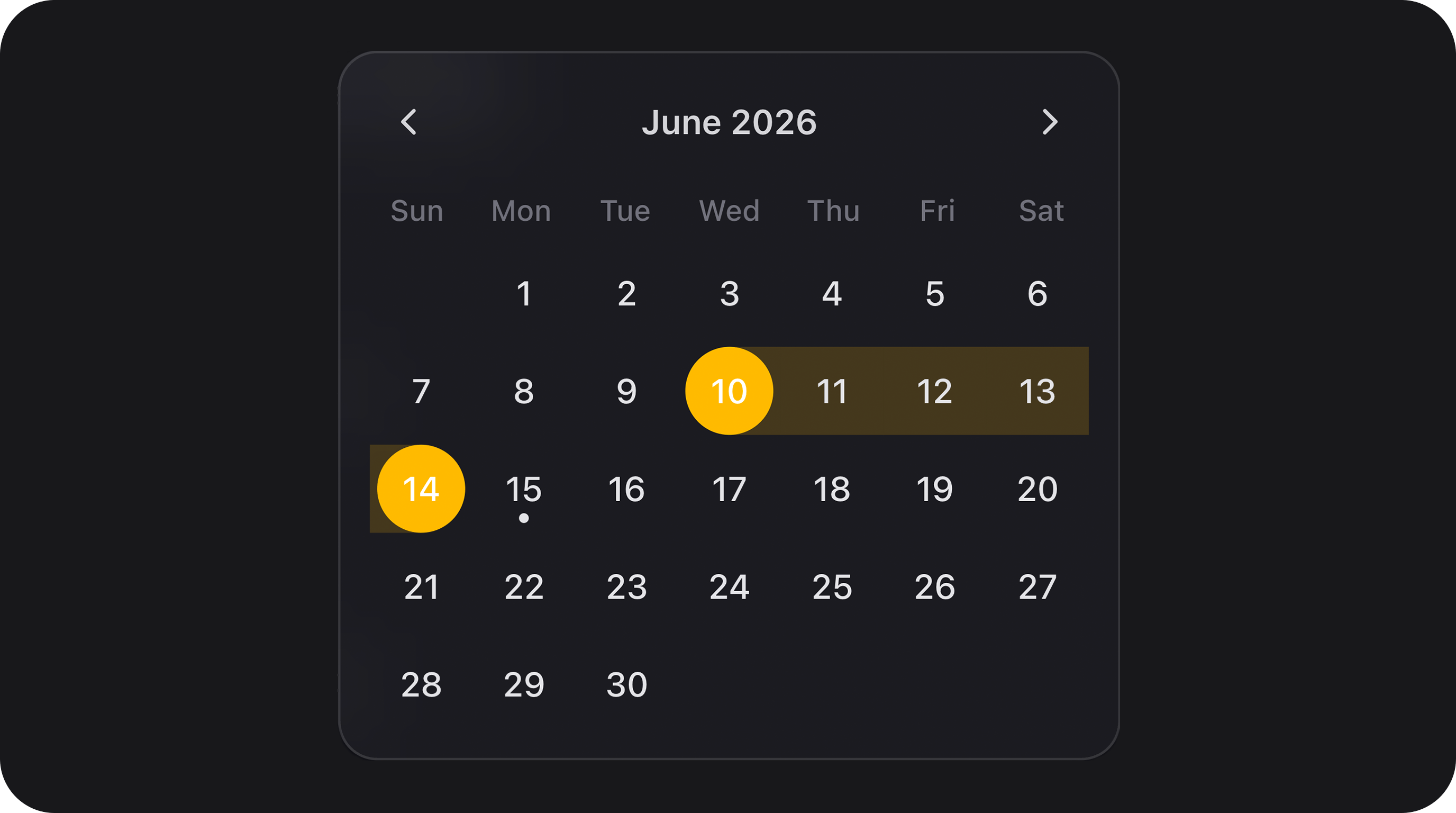
Calendar UX
Components withshowCalendar() expose a teleported popover calendar:
- Month navigation — chevron previous/next; header label click drills down: days → months → years (Spectrum-style).
- FlexMonthPicker (with year segment) — opens on the years grid; pick a year → months grid.
- FlexMonthPicker with
showYearSegment(false)— opens directly on the months grid (no year selection step). - FlexYearPicker — year grid only.
- Locale — calendar labels use the configured locale; month names in the grid are always short form.
- Range selection — continuous pill highlight between start and end; hover preview while selecting end.
- Today — optional dot via
highlightToday(). - Primary color — selected day uses theme
--primary-500. - Time under calendar — when time granularity is enabled, editable time segments appear below the grid (single row for
FlexDateTimePicker, start/end rows forFlexDateRangeField).
FlexField schema config
When usingFlexFieldFormBuilder, these FieldType values map to components with withRecommendedDefaults():
FieldType | Component |
|---|---|
date | FlexDateField |
time | FlexTimeField |
date_time | FlexDateTimePicker |
date_range | FlexDateRangeField |
month | FlexMonthPicker |
year | FlexYearPicker |
FlexDatePicker, custom displayFormat, etc.).
Public helper methods
| Method | Returns | Description |
|---|---|---|
getMode() | DateTimeFieldMode | date, time, dateTime, dateRange, month, year, duration, timeRange |
getVariant() | string | primary, secondary, flat |
getGranularity() | DateTimeGranularity | Resolved granularity |
getLocale() | string | Effective locale |
getTimeZone() | string | IANA timezone |
getHourCycle() | int | 12 or 24 |
getDisplayFormat() | string | Resolved display format |
getStorageFormat() | string | Resolved storage format |
shouldForceLeadingZeros() | bool | Leading zero padding |
getMinValue() / getMaxValue() | mixed | Raw configured bounds |
getRangeSeparator() | string | Range text separator |
shouldAllowSameDay() | bool | Same-day range allowed |
shouldHighlightToday() | bool | Today dot in calendar |
shouldShowCalendar() | bool | Calendar popover enabled |
shouldShowCalendarButton() | bool | Trailing calendar button |
shouldCloseOnSelect() | bool | Auto-close on date pick |
getFirstDayOfWeek() | int | Calendar week start |
shouldHideTimeZone() | bool | Timezone segment hidden |
shouldHideTimeSection() | bool | Time rows under calendar hidden |
shouldShowSeconds() | bool | Second segment visible |
shouldShowYearSegment() | bool | Year segment visible (month picker) |
getMonthDisplay() | MonthDisplay | Month segment display mode |
normalizeState(mixed $state) | string|array|null | Canonical stored value |
isEmptyState(mixed $state) | bool | Whether value is considered empty |
getAlpineConfiguration() | array | Full Alpine bootstrap payload |
getViewSegments() | array | SSR segment hydration |
getWrapperClasses() | list<string> | CSS class list |
CSS classes
| Class | Role |
|---|---|
fff-date-time-field | Root wrapper |
fff-date-time-field--{date|time|dateTime|dateRange|month|year} | Mode modifier |
fff-date-time-field--{sm|md|lg} | Size modifier |
fff-date-time-field--{primary|secondary|flat} | Variant modifier |
fff-date-time-field--show-seconds | Wider shell when seconds visible |
fff-date-time-field--textual-month | Month segment uses short/long text (not numeric) |
fff-date-time-field--textual-month-short | Short month labels in segment (cze) |
fff-date-time-field--textual-month-long | Long month labels in segment (czerwiec) |
fff-date-time-field__shell | Pill input border (FlexTextInput shell) |
fff-date-time-field__segments | Segment group |
fff-date-time-field__segment | Individual segment input |
fff-date-time-field__segment-error | Client-side validation message below shell (role="alert") |
fff-date-time-field__suffix | Calendar button column |
fff-date-time-field__calendar | Teleported popover (is-positioned when placed) |
fff-date-time-field__day.is-selected | Selected calendar day (primary background) |
fff-date-time-field__time-rows | Time editor under calendar |
--fff-date-time-month-ch on the root wrapper for character-width sizing.
Segment focus uses theme primary (--primary-500) for active background and ring.
Implementation notes
- Client logic:
resources/js/components/flex-date-time-field.js(Alpine), bundled toresources/dist/components/flex-date-time-field.js. - Date math:
@internationalized/dateviaresources/js/core/date-time/. - SSR segment values in Blade prevent layout shift on first paint; Alpine hydrates from
initialSegments. - Playground section Date & time fields in
DateTimeFieldPlaygrounddemonstrates all variants, configuration presets, and bounds/format examples. - Playground section Month display in
DateTimeFieldPlaygrounddemonstratesmonthDisplay()(numeric, short, long) across month picker, date, and datetime fields, plusshowYearSegment(false)month-only mode. - Rebuild assets after CSS/JS changes — see Assets & playground.