| Class | Bjanczak\FilamentFlexFields\Filament\Schemas\Components\ProgressCircle |
| State | None — display-only schema component |
| Playground | progress-circle |
| Stylesheet | Lazy progress-circle bundle |
Basic usage
Configuration API
value(float|int|Closure|null $value) / max(float|int|Closure $max)
Arc fill ratio. Default max: 100.
displayValue(string|Closure|null $value)
Primary center text (e.g. '69%'). Auto-derived from percent when omitted.
fraction(string|Closure|null $fraction) / label(string|Closure|null $label)
Secondary slots: fraction line ('124 / 223') and label ('Grade rating').
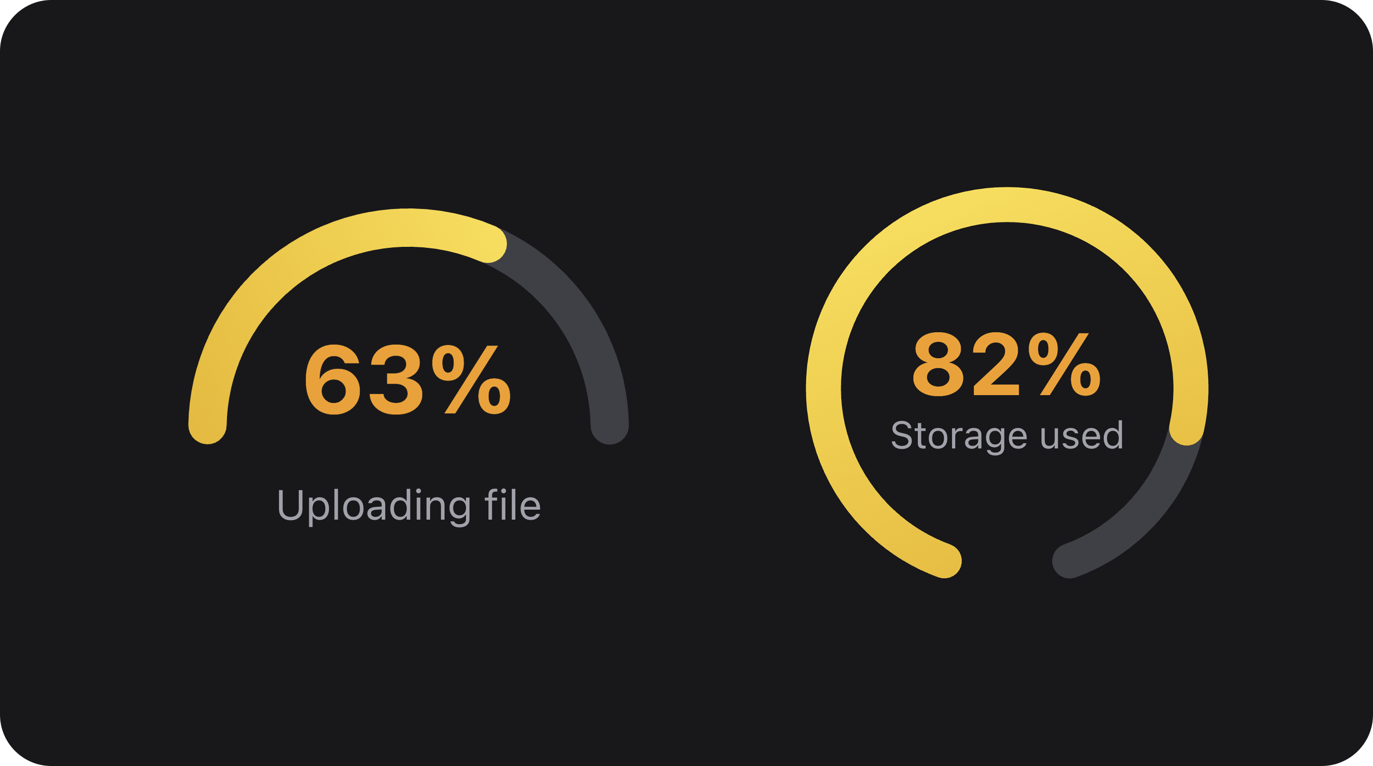
variant('circle'|'semicircle')
| Variant | Arc | Content |
|---|---|---|
circle (default) | Full or near-full ring | Centered in ring |
semicircle | Wide bottom arc (210° span minus gap) | Percent on arc floor; label below arc |
gapAngle(float|int|Closure $degrees)
Degrees of empty gap at the bottom of the arc. Used with circle (near-full ring) or semicircle (narrows arc). Default: 0.
contentLayout('center'|'left')
| Layout | Description |
|---|---|
center (default) | Text inside the circle/arc |
left | Text block beside the circle (e.g. completion rate card) |
paused(bool|Closure $condition = true) / pausedIcon(string|BackedEnum|Htmlable|Closure|null $icon)
Show paused state with center icon instead of progress text.
gradientFrom() / gradientTo() / gradientStroke(string|Closure|null $gradient)
Gradient on the progress stroke (fill arc):
trackGradientFrom() / trackGradientTo()
Optional gradient on the track (unfilled) stroke:
shell(bool|Closure $condition = true) / heading() / description() / footer()
Card chrome around the circle:
color(string|Closure|null $color) / size('sm'|'md'|'lg')
Semantic stroke color and diameter scale.
Layout notes
- Semicircle:
displayValuesits on the arc floor; withlabel(), label renders below the arc (not inside the gap). - Circle +
gapAngle: near-full ring with centered percent only (no below-label layout). - Gradient applies to fill by default; track gradient only when
trackGradientFrom/Toare explicit.
Public helper methods
| Method | Returns | Description |
|---|---|---|
getProgressRatio() | float | Fill ratio 0–1 |
getPercentage() | int | Rounded percent |
getSvgMetrics() | array | ViewBox, radii, arc paths |
hasGapArc() | bool | Bottom gap enabled |
hasBelowLabel() | bool | Label below semicircle |
hasGradientStroke() | bool | Fill gradient active |
usesExplicitTrackGradient() | bool | Custom track gradient |
hasShell() / hasCardChrome() | bool | Card wrapper |
CSS classes
| Class | Role |
|---|---|
fff-progress-circle | Root |
fff-progress-circle--{sm|md|lg} | Size |
fff-progress-circle--semicircle | Semi variant |
fff-progress-circle--has-gap | Gap arc |
fff-progress-circle--has-below-label | Label under arc |
fff-progress-circle--has-gradient | Gradient fill |
fff-progress-circle--has-track-gradient | Gradient track |
fff-progress-circle__svg | SVG element |
fff-progress-circle__content | Text slots |