| Class | Bjanczak\FilamentFlexFields\Filament\Schemas\Components\ProgressBar |
| State | None — display-only schema component |
| Playground | progress-bar |
| Stylesheet | Lazy progress-bar bundle |
Basic usage
Configuration API
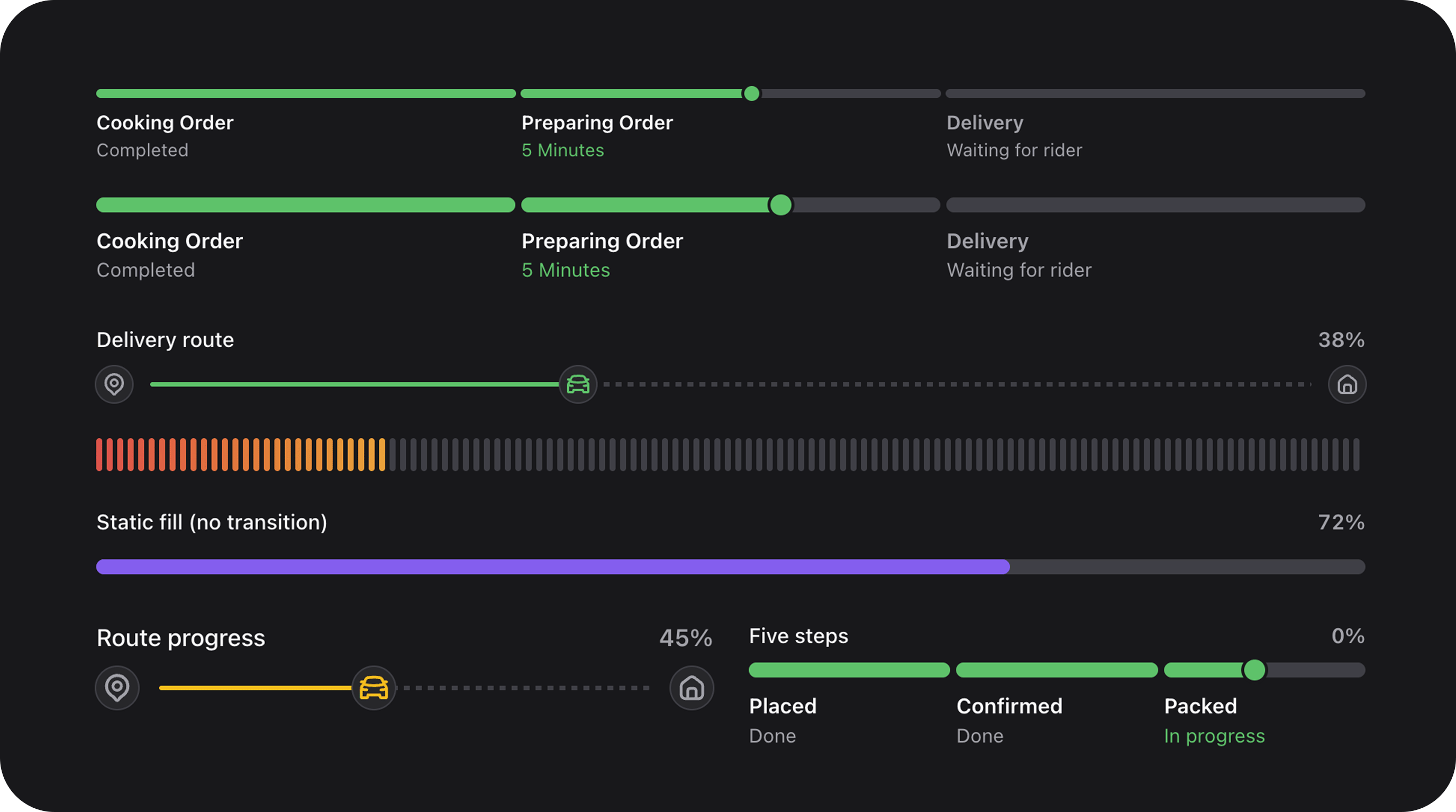
value(float|int|Closure|null $value) / max(float|int|Closure $max)
Numeric progress. Default max: 100. Ratio = value / max.
label(string|Closure|null $label)
Header text above the track.
displayValue(string|Closure|null $value) / showValue(bool|Closure $condition = true)
Custom formatted value string. When showValue() is true, shown beside the label (or as badge when valueBadge()).
valueBadge(bool|Closure $condition = true)
Render the value as a pill badge in the header instead of inline text.
color(string|Closure|null $color)
Semantic track/fill color: primary, success, warning, danger. Default: primary.
indeterminate(bool|Closure $condition = true)
Animated loading bar when progress is unknown:
variant('default'|'pills') / pillCount(int|Closure $count)
| Variant | Description |
|---|---|
default | Single continuous track |
pills | Segmented pill track; value = number of filled pills |
pillCount is omitted in pills mode, count is derived from max.
gradientFrom(string|Closure|null $color) / gradientTo(string|Closure|null $color)
CSS color stops for gradient fill (pills and default track):
segments(array|Closure|null $segments) / activeSegment(int|Closure|null $index)
Stepped delivery-tracker mode. Each segment: label, optional icon, optional color.
segmentThumb(bool|Closure $condition = true) / activeSegmentProgress(float|Closure $progress)
Show a draggable-style thumb on the active segment. activeSegmentProgress (0–1) controls partial fill within the active step.
startMarker() / currentMarker() / endMarker()
Optional icons at track start, current position, and end (string|BackedEnum|Htmlable).
remainingTrackStyle('solid'|'dashed')
Style of the unfilled portion of the track. Default: solid.
shell(bool|Closure $condition = true) / description() / footer()
Optional card chrome wrapping the bar:
size('sm'|'md'|'lg')
Track height and typography scale. Default: md.
Public helper methods
| Method | Returns | Description |
|---|---|---|
getProgressRatio() | float | value / max clamped 0–1 |
getPercentage() | int | Rounded percent |
getFormattedValue() | string | Display string |
getNormalizedSegments() | array | Segment metadata |
isIndeterminate() | bool | Loading mode |
isPillsVariant() | bool | Pills mode |
getActivePillCount() | int | Filled pills |
hasShell() / hasCardChrome() | bool | Card wrapper state |
CSS classes
| Class | Role |
|---|---|
fff-progress-bar | Root |
fff-progress-bar--{sm|md|lg} | Size |
fff-progress-bar--indeterminate | Loading animation |
fff-progress-bar--pills | Pill variant |
fff-progress-bar--segments | Stepped tracker |
fff-progress-bar__track | Track background |
fff-progress-bar__fill | Filled portion |