Summary
SaaS-style single-select card group (radio behaviour).| Class | Bjanczak\FilamentFlexFields\Filament\Forms\Components\ChoiceCards |
| State type | string|null — one option key |
| Model cast | 'plan' => 'string' or backed enum |
| FieldType | choice_cards |
Basic usage
Validation
| Behaviour | Detail |
|---|---|
| Built-in | Rule::in(...) — value must be a key from options() |
required() | At least one option must be selected |
Configuration API
options(array|Closure $options)
Option list. See Rich card option shape.
disabledOptions(array|Closure $keys)
Disables options by key. Merged with per-option disabled.
layout(string|Closure $layout)
| Value | Description |
|---|---|
stack | Vertical list of cards. Default. |
grid | Responsive column grid. Use with gridColumns(). |
media | Horizontal row: icon + text. Best for icon-led options. |
featured | Plan-style cards: icon box, badge, large price. |
gridColumns(int|array|Closure $columns)
Column count for grid and multi-column media layouts.
sm → md → lg). Maximum: 4 columns.
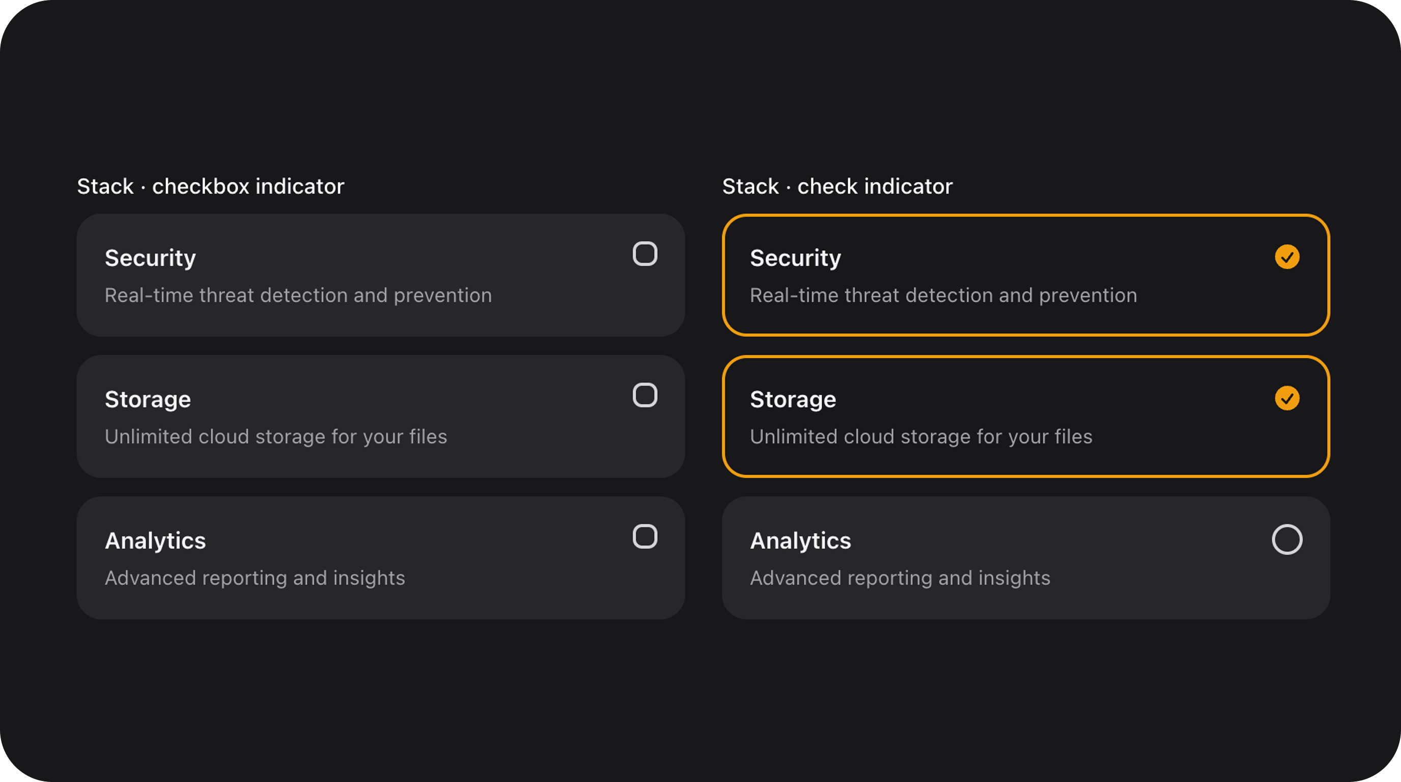
indicator(string|Closure|null $indicator)
Selection marker in the top-right corner.
| Value | Description |
|---|---|
radio | Radio dot. Default for stack. |
check | Filled circle with checkmark. Default for featured. |
none | Border-only selection. Default for media. |
layout().
variant(string|Closure $variant)
| Value | Description |
|---|---|
default | Standard grey card background. |
primary | Stronger selected state (featured plans). |
secondary | Subtle grid styling. |
color(string|Closure|null $color)
Accent color for the selected border. Default: primary. Supports Filament color tokens (success, danger, etc.).
size(string|ControlSize|Closure $size)
Scales padding, typography, indicators, and icons. See Control size.
ripple(bool|Closure $condition = true)
Enables a Material-style click ripple on each card.
Animations
- Smooth border and background transitions on select/deselect
- Indicator scale animation for
check/radiostates - Respects
prefers-reduced-motion
FlexField schema config
When built viaFlexFieldFormBuilder:
| Config key | Maps to |
|---|---|
options | options() |
layout | layout() |
grid_columns / columns | gridColumns() |
size | size() |
variant | variant() |
color | color() |
ripple | ripple() |
indicator | indicator() |
disabled_options | disabledOptions() |