Summary
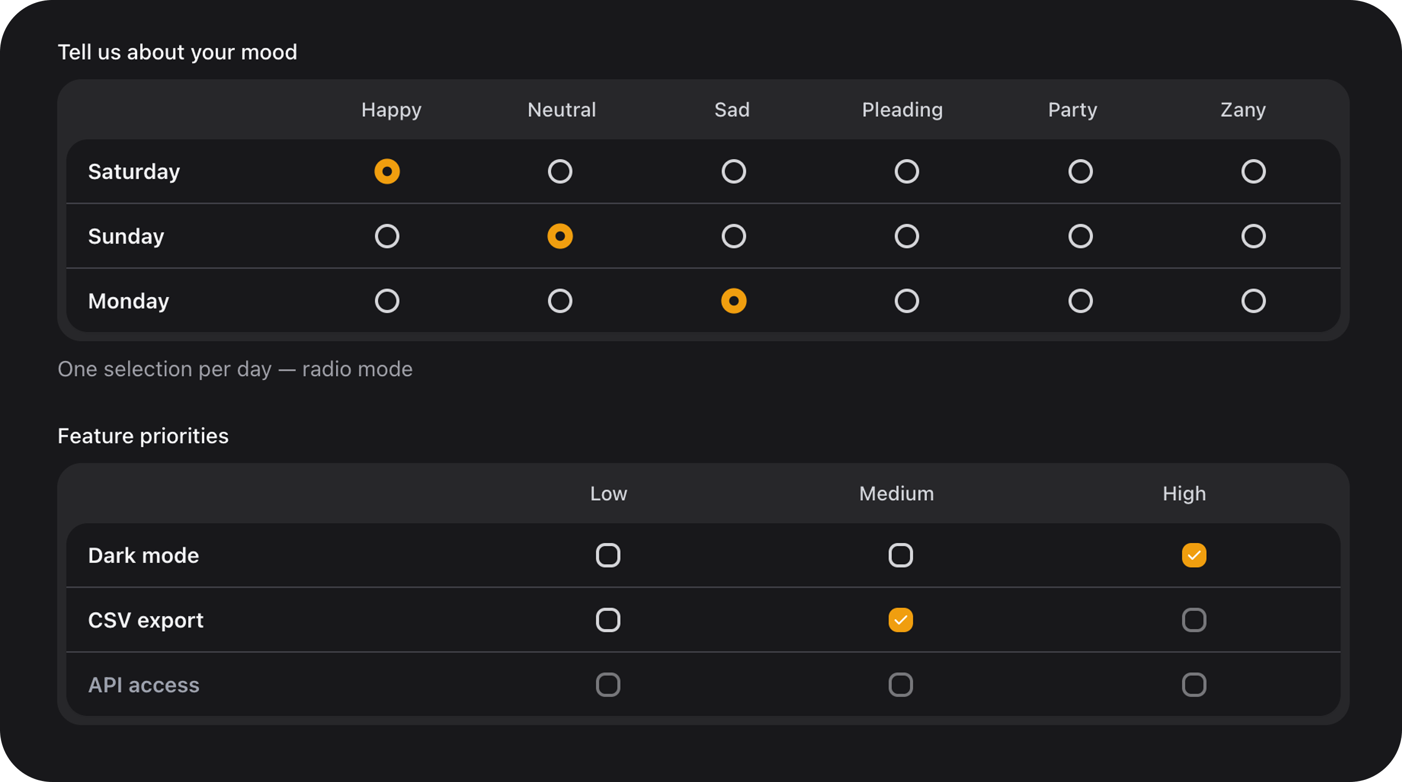
Multiple choice grid (matrix / survey table): row labels on the left, column headers on top, radio or checkbox in each cell. Gray inset frame with white body panel. Per-row validation and reactive conditional disabling (nolive() required).
| Class | Bjanczak\FilamentFlexFields\Filament\Forms\Components\MatrixChoiceField |
| State type | Radio: array<string, string|null> · Checkbox: array<string, list<string>> |
| FieldType | matrix_choice |
| Playground | matrix-choice |
| Stylesheet | Lazy matrix-choice-field bundle |
| Model cast | 'responses' => 'array' or 'responses' => 'json' |
UsematrixColumns()— notcolumns()— becausecolumns()is reserved by Filament layout grids.
Full example
Row option shape
Each key inrows() is stored in the database. Value can be a plain string (used as label) or a rich array:
| Key | Type | Default | Description |
|---|---|---|---|
label | string | row key | Left column row title |
description / desc | string|null | null | Optional subtitle under row label |
required | bool | false | Row must have at least one selection. Overrides requiredRows() when set explicitly |
disabled | bool | false | Entire row locked (all cells disabled) |
min_selections / min | int|null | null | Checkbox only — minimum selected columns in this row |
max_selections / max | int|null | null | Checkbox only — maximum selected columns in this row |
Column option shape
Each key inmatrixColumns() is a selectable column id (stored in state).
| Form | Example |
|---|---|
key => 'Label' | 'happy' => 'Happy' |
| Rich array | 'high' => ['label' => 'High', 'icon' => 'heroicon-o-bolt', 'disabled' => true] |
| Key | Type | Description |
|---|---|---|
label | string | Header text (or emoji) shown above cells |
icon | string|null | Optional Heroicon above label (alternative to columnIcons()) |
disabled | bool | Disables this column in every row |
State format
Radio mode — one column key per row (or omitted if empty):- Default state:
[] - On dehydrate, empty rows and invalid keys are stripped
- Use Eloquent cast
'field' => 'array'or'field' => 'json'
Validation
Built-in (per row)
| Rule | Radio | Checkbox | Detail |
|---|---|---|---|
required on row | ✓ | ✓ | Row must have a selection |
requiredRows([...]) | ✓ | ✓ | Mark rows required by key |
required() on field | ✓ | ✓ | All non-disabled rows required when no requiredRows() set |
min_selections | — | ✓ | Min columns selected in row |
max_selections | — | ✓ | Max columns selected in row |
Static disabled / disabledRows | ✓ | ✓ | Selection in locked row fails |
disabledCells | ✓ | ✓ | Selection in locked cell fails |
disableCellWhen / disableRowWhen | ✓ | ✓ | Same rules enforced server-side |
resources/lang/en/default.php):
| Key | When |
|---|---|
validation.matrix_choice.invalid | State is not an array |
validation.matrix_choice.invalid_option | Unknown or disabled column selected |
validation.matrix_choice.row_required | Required row empty (:row) |
validation.matrix_choice.row_min | Too few selections (:row, :count) |
validation.matrix_choice.row_max | Too many selections (:row, :count) |
Custom cross-row rules
Use standard Filament->rule() for business logic across rows:
Configuration API
mode('radio'|'checkbox')
| Value | Behaviour |
|---|---|
radio (default) | Exactly one column per row |
checkbox | Zero or more columns per row |
rows(array|Closure $rows)
Row definitions — see Row option shape. Accepts Closure for dynamic rows.
matrixColumns(array|Closure $columns)
Column headers — see Column option shape.
columnIcons(array|Closure $icons)
Per-column icon map merged into column metadata:
requiredRows(array|Closure $keys)
Mark rows as required without inline required => true:
disabledRows(array|Closure $keys)
Lock entire rows by key (static, always on):
disabledCells(array|Closure $map)
Lock specific cells. Map shape: rowKey => [columnKey, ...]:
Closure for server-side dynamic maps (re-evaluated on each render; use with live() for server-driven updates).
disableCellWhen($row, $column, $whenRow, $whenColumns)
Reactive (client-side Alpine) — disable one cell when a trigger row matches column key(s). No live() needed.
| Argument | Description |
|---|---|
$row | Target row to disable |
$column | Target column to disable |
$whenRow | Row to watch |
$whenColumns | string or list<string> — trigger column key(s) |
| Trigger mode | Match condition |
|---|---|
radio | whenRow selected column equals one of whenColumns |
checkbox | whenRow selection includes any of whenColumns |
disableRowWhen($row, $whenRow, $whenColumns)
Reactive — disable an entire row when trigger row matches:
size('sm'|'md'|'lg')
Control scale for row labels, column headers, and radio/checkbox indicators. Default: md.
color('primary'|'secondary'|'success'|'warning'|'danger'|null)
Filament accent for selected radio/checkbox indicators. Default: primary.
Inherited Filament field API
Also supports standard Inherited Filament field API:| Method | Typical use |
|---|---|
label() / helperText() | Field title above grid |
required() | All rows required (unless requiredRows() narrows scope) |
disabled() | Disable entire field |
default() / dehydrated() | Initial state and persistence |
live() | Optional — not needed for disableCellWhen / disableRowWhen |
afterStateUpdated() | React to changes (autosave, logging) |
rule() | Custom validation (see above) |
Public helper methods
| Method | Returns | Description |
|---|---|---|
getMode() | string | radio or checkbox |
isCheckboxMode() | bool | Checkbox mode flag |
getRowKeys() / getColumnKeys() | list<string> | Valid keys |
getNormalizedRows() | array | Merged row metadata |
getNormalizedColumns() | array | Merged column metadata |
getDisabledCellsMap() | array<string, list<string>> | Static disabled cells |
getConditionalDisableRules() | list<array> | disableCellWhen / disableRowWhen rules |
matchesConditionalDisableRule($rule, $state) | bool | Test rule against state |
isRowDisabled($row, $state?) | bool | Static + conditional row lock |
isCellDisabled($row, $column, $state?) | bool | Static + conditional cell lock |
dehydrateValue($state) | array | Normalize state for storage |
getWrapperClasses() | list<string> | fff-matrix-choice BEM classes |
getMatrixSizeStyles() | array | CSS custom properties |
FlexField schema config
| Config key | Maps to |
|---|---|
mode | mode() |
rows | rows() |
columns | matrixColumns() |
column_icons | columnIcons() |
disabled_rows | disabledRows() |
required_rows | requiredRows() |
disabled_cells | disabledCells() |
disable_cell_when | disableCellWhen() — list of rule arrays |
disable_row_when | disableRowWhen() — list of rule arrays |
size | size() — default from config('filament-flex-fields.ui.matrix_choice_size', 'md') |
color | color() |
disable_cell_when / disable_row_when rule array:
CSS classes
| Class | Role |
|---|---|
fff-matrix-choice | Root wrapper |
fff-matrix-choice--{sm|md|lg} | Size modifier |
fff-matrix-choice--{radio|checkbox} | Mode modifier |
fff-matrix-choice__frame | Gray outer frame |
fff-matrix-choice__header | Column header row |
fff-matrix-choice__body | White inset panel |
fff-matrix-choice__row | Data row |
fff-matrix-choice__cell | Clickable grid cell |
fff-matrix-choice__cell.is-selected | Selected cell (animated indicator) |
fff-matrix-choice__cell.is-disabled | Locked cell |
Implementation notes
- Radio/checkbox indicators reuse Flex Radiolist / Flex Checklist animation tokens (
fff-choice-cards-indicator-pop). - All clicks are handled on
fff-matrix-choice__cell; inner inputs usepointer-events-noneto prevent double-toggle. - Conditional rules run in Alpine on every state change;
pruneDisabledSelections()clears invalid picks. - Playground slug:
matrix-choice(demos: mood radio grid + feature priorities checkbox).