

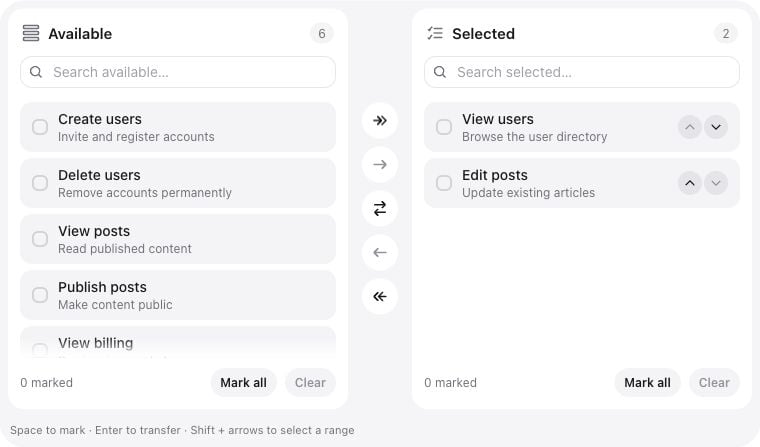
Summary
Multi-select with “Available” and “Selected” panes. Supports real-time search, drag-and-drop reordering, double-click transfer, and virtual scrolling for high-performance handling of thousands of options.Basic usage
Standard role selection
Locked options
Lock keys against transfer in the interface. Locked items already in Selected can still be reordered.Custom labels and height
State & validation
Stored value
The field stores an array of keys from theoptions() list. The order of keys matches the order in the “Selected” pane. reorderable() controls whether users can change that order.
array cast for this attribute. The field validates and dehydrates form state; your Filament resource or application saves it to the model.
Validation Rules
The server rejects non-list values, nested or boolean keys, duplicates, unknown option keys and count violations. Integer keys are stored as strings. Empty selections are valid unlessrequired(), minItems() or exactItems() says otherwise. Call the form’s validated getState() before persisting; do not save raw client properties. Apply record, tenant and permission policies in the application.
You can enforce minimum or maximum selection counts:
Advanced Features
Virtual Scrolling
When the number of options exceeds 100, the component automatically enables virtual scrolling. Only the visible rows and a small buffer are rendered. Search still operates on the complete supplied option list. Adjust the threshold withvirtualThreshold(100). Virtualization limits DOM work; it does not paginate options or remove the initial data payload. The supported option limit is 50,000.
Search behavior
Both panes search labels and descriptions locally. Matching ignores case and combining accents:sao matches São. Queries are limited to 256 characters. Counts show the number of matches in each pane; searching does not remove stored selections. Mark all and bulk-add actions operate on the current filtered Available list.
Double-click Transfer
Users can double-click an unlocked item to move it to the other pane, subject to the maximum selection count. This can be disabled viamoveOnDoubleClick(false).
Reorder selected items
Drag items in the Selected pane to change order, including locked (disabledOptions) rows. Those rows cannot be moved to Available. Arrow buttons remain as an accessible fallback. Disable both with reorderable(false). On stacked (narrow) layouts, transfer arrows point up and down.
Multi-select on touch
Tap options to mark several without modifiers. On desktop, click the checkmark to toggle individual marks, use Cmd/Ctrl + click for additive selection, or Shift + click for a range. On phones and tablets, scroll the list normally. Hold one item still for a moment to pick it up — a stacked preview follows that thumb, with a count badge when more than one item is held. Tap more items with another finger to add them to the stack. After you drop the group, the highlight is cleared. Drop on the Selected list to insert before or after a row (upper vs lower half), or on Available to remove items from Selected. Transfer buttons still move the whole selection. On desktop, hold Cmd/Ctrl (or Shift for a range) and use drag-and-drop in the Selected pane.Keyboard and RTL
Set
dir="rtl" on the surrounding form or container. Pane layout, action direction and logical spacing follow that direction. Narrow containers stack the panes and rotate transfer arrows vertically. Long labels and descriptions are truncated in fixed-height rows; the full text remains in the row’s title.
Rich options
Custom Icons
Transfer, reorder and search icons can be customized to match your UI. Pane heading icons, the lock indicator and the shared Checklist checkmark are fixed.Configuration API
Configuration methods below accept aClosure. icons() evaluates its map when called; use the individual icon setters for icons that must be evaluated with the field context.
Option format and localization
Option keys must be strings or integers with valid UTF-8 text, at most 512 bytes and without control characters. Labels accept up to 4,096 bytes and descriptions up to 8,192 bytes of UTF-8 text. A rich option may containlabel, description and the boolean disabled flag; omitting label uses its key. Supply plain text, not HTML.
availableLabel() and selectedLabel() customize pane headings. Search placeholders, empty states, action labels and keyboard hints use the package translations. Override keys in your application’s lang/vendor/filament-flex-fields/en/default.php (change en for another locale):
Real-world examples
User Permissions Management
Use your application’sPermission model. Convert the query result to an array; options() does not accept a Collection.
Exactly three choices
Minimal and read-only interfaces
Sizes and variants
bordered variant name is retained for compatibility; its current workspace and option cards do not add outlines. The three variants change the workspace surface. Search follows the shared Flex Text Input presentation independently.
When options() depends on another field, its closure is reevaluated on the server. Reset or replace the selected value when the permitted options change; outdated keys fail validation rather than being silently accepted.
Playground
/admin/flex-fields/dual-listbox when the panel uses the /admin prefix.
The playground includes descriptions, interaction locks, three sizes, visual variants, read-only and disabled fields, selection limits and a 1,000-option virtual list.
See Installation for setup.
Related components
Appearance and icon configuration
The workspace has a 24 px outer radius. Its inner panels derive their radius from that value minus the 8 px workspace inset (16 px), so nested corners remain aligned. Scroll edges use fixed gradients that fade in and out; reaching the start or end removes the corresponding fade. Search reuses Flex Text Input’s shell and control with its shadow-freeprimary variant and whole-control focus outline. Option cards remain visible before hover. Checkmarks share the same shape and animation as Flex Checklist. Both controls use Hugeicons by default and respect reduced-motion preferences.
icons() accepts these keys: search, move_all_right, move_right, swap, move_left, move_all_left, move_up, move_down. Individual setters are searchIcon(), moveAllRightIcon(), moveRightIcon(), swapIcon(), moveLeftIcon(), moveAllLeftIcon(), moveUpIcon() and moveDownIcon(); each accepts a registered icon name, enum, HTML icon or closure.
listHeight() accepts a positive simple length in px, rem, em, vh or dvh. Count settings accept 0–50,000 or null; the minimum cannot exceed the maximum. rounding() configures the shared rounding token, including search controls; it does not change the workspace’s outer 24 px radius.