Summary
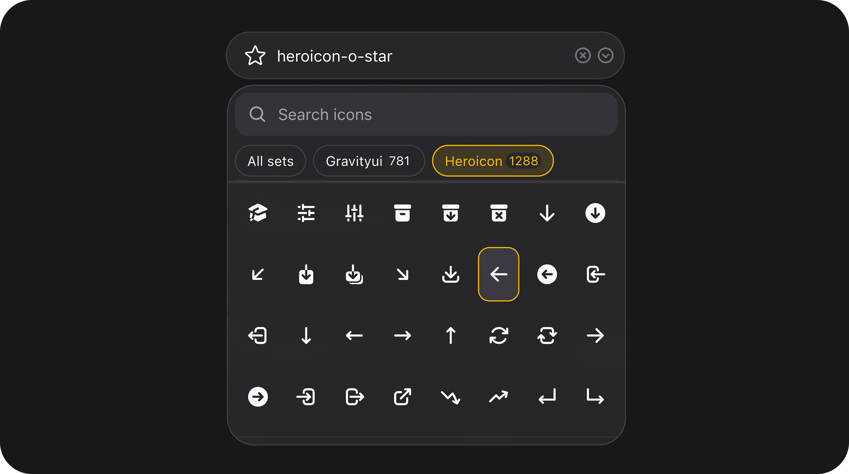
Searchable blade-icons picker with lazy SVG rendering, set filters, whitelist/exclude controls, paginated server-side search, and virtual scrolling for large catalogs. Stores the full icon name string (for exampleheroicon-o-star, gravityui-star).
| Class | Bjanczak\FilamentFlexFields\Filament\Forms\Components\IconPickerField |
| Extends | Filament\Forms\Components\Field |
| State type | string|null |
| FieldType | icon_picker |
Basic usage
State format
| Value | Description | Example |
|---|---|---|
| Selected icon | Full blade-icons name stored as a plain string | heroicon-o-star |
| Empty | null when cleared or never selected | null |
generate_icon_html() or <x-icon> — no extra wrapper object.
Use the value anywhere Filament accepts an icon name:
Usage on the frontend
The field stores the full blade-icons name in your database (for exampleheroicon-o-star, gravityui-star). On the frontend, treat it like any other static icon name — no JSON decoding or custom serializer.
Assuming the icon is saved on a $category model as $category->icon:
<x-icon> name.
For read-only display in Filament admin tables, use IconColumn instead of rebuilding the cell yourself.
Validation
| Behaviour | Detail |
|---|---|
| Built-in | Custom rule checks the value against the configured catalog (sets, whitelist, exclude list) |
required() | Empty / null state fails with the standard required message |
| Invalid icon | Fails with filament-flex-fields::default.validation.icon_picker.invalid |
->icons([...])) is strict: only listed names pass validation, even if they exist in a broader set.
Setup
IconPickerField reads any blade-icons set registered in your Laravel app (Heroicons ship with Filament; Gravity UI icons ship with this plugin viajanczakb/blade-gravity-icons).
Set names vs prefixes — sets() accepts either the blade-icons set key or an icon prefix:
| You pass | Resolves to |
|---|---|
heroicons | Heroicons set |
gravity-icons | Gravity UI set |
gravityui | Same Gravity UI set (matched by prefix) |
heroicon | Heroicons set (matched by prefix) |
->sets() is omitted, all installed sets are indexed. Restrict globally via config:
resources/dist/icon-catalog-manifest.json. Disable with icon_picker_use_bundled_manifest => false if you prefer live blade-icons scanning.
Configuration API
sets(array|string|Closure|null $sets = null)
Limit available icon libraries. null uses all installed sets, or config('filament-flex-fields.ui.icon_picker_sets') when that config is a non-empty array.
icons(array|Closure $icons)
Whitelist only these full icon names. Set tabs and search operate inside the whitelist.
excludeIcons(array|Closure $icons)
Remove icons from the catalog after sets are resolved.
searchResultsLayout(string|Closure $layout)
Dropdown result layout. Default: icons.
| Layout | Description |
|---|---|
icons | Icon-only grid cells (default) |
grid | Grid with icon + human-readable label |
list | Vertical list rows with icon + label |
gridColumns(int|Closure $columns)
Column count for grid / icons layouts. Clamped to 2–12. Default: 8.
closeOnSelect(bool|Closure $condition = true)
Close the teleported panel after picking an icon. Default: true.
preload(bool|Closure $condition = true)
Fetch the first results page when the Alpine component mounts (before the panel opens). Default: false.
limitPerSet(int|Closure|null $limit)
Cap how many icons are indexed per set. Useful for demos or constrained pickers.
perPage(int|Closure $perPage)
Server page size for search / infinite scroll. Default: 64, maximum: 96.
clearable(bool|Closure $condition = true)
Show the clear (×) control when a value is selected. Default: true.
variant(string|Closure $variant)
Visual shell shared with SelectField. Values: bordered (default), secondary, flat, soft, faded, underlined. Legacy primary maps to bordered.
size(string|ControlSize|Closure $size)
Control height. See Control size. Default: md, or config('filament-flex-fields.ui.icon_picker_size').
placeholder(string|Closure|null $placeholder)
Trigger placeholder when no icon is selected. Default translation: Select an icon.
readOnly(bool|Closure $condition = true)
Inherited from Filament CanBeReadOnly. Prevents opening the panel and clearing the value.
focusOutline(bool|Closure $condition = true)
Inherited from HasFieldFocusOutline.
chevronIcon() / clearIcon() / selectedOptionCheckIcon()
Inherited from HasSelectFieldIcons. Override trigger chevron, clear button, or selected checkmark. Defaults come from config('filament-flex-fields.ui.select_*_icon') or Gravity UI fallbacks.
Prefix / suffix affixes
Inherited from FilamentHasAffixes — prefixIcon(), suffixIcon(), prefixActions(), suffixActions(), and related helpers work on the trigger shell.
Public helper methods
| Method | Returns | Description |
|---|---|---|
getConfiguredSets() | list<string>|null | Raw sets() config |
getResolvedSetNames() | list<string> | Normalized blade-icons set keys |
getWhitelistedIcons() | list<string> | Whitelist from icons() |
getExcludedIcons() | list<string> | Exclusions from excludeIcons() |
getSearchResultsLayout() | string | grid, list, or icons |
getGridColumns() | int | Clamped column count |
shouldPreload() | bool | Preload flag |
shouldCloseOnSelect() | bool | Close-on-select flag |
getPerPage() | int | Page size |
getLimitPerSet() | int|null | Per-set cap |
isClearable() | bool | Clear button enabled |
getVariant() | string | Resolved variant |
getSize() | string | Resolved size |
isAllowedIcon(string $icon) | bool | Whether the icon is in the effective catalog |
searchIcons(string $query, ?string $set, int $page) | array | Ranked search payload |
renderIconHtml(?string $icon) | string | SVG HTML for trigger / previews |
renderIconSvgs(array $icons) | list<array{name, html}> | Batch SVG render with server cache |
getIconPickerSearchResults(...) | array | Livewire @Renderless search endpoint |
getIconPickerSvgPreviews(array $icons) | list<array{name, html}> | Livewire @Renderless SVG batch (max 48 icons) |
getWrapperClasses() | array<string, bool|string> | CSS class map for the trigger |
getAvailableSetsForJs() | list<array> | Set summaries for Alpine (key, prefix, label, count) |
FlexField schema config
When usingFieldType::IconPicker / FlexFieldFormBuilder:
| Config key | Type | Maps to |
|---|---|---|
sets | array|string|null | sets() |
icons | string[] | icons() |
exclude_icons | string[] | excludeIcons() |
search_results_layout / layout | grid|list|icons | searchResultsLayout() |
close_on_select | bool | closeOnSelect() |
grid_columns | int | gridColumns() |
preload | bool | preload() |
limit_per_set | int|null | limitPerSet() |
per_page | int | perPage() |
size | sm|md|lg | size() — default from icon_picker_size |
variant | string | variant() — default from icon_picker_variant |
Global config
| Key | Default | Purpose |
|---|---|---|
icon_picker_sets | null | Default sets() when not set on the field |
icon_picker_size | md | Default size for form-builder fields |
icon_picker_variant | bordered | Default variant for form-builder fields |
icon_picker_index_cache_days | 7 | TTL for indexed catalog pools |
icon_picker_catalog_cache_days | 7 | TTL for resolved set catalogs |
icon_picker_svg_cache_days | 30 | TTL for rendered SVG HTML |
icon_picker_search_cache_minutes | 60 | TTL for ranked search responses (0 disables) |
icon_picker_use_bundled_manifest | true | Prefer icon-catalog-manifest.json over live scanning |
UX
- Trigger — Select-style pill with live SVG preview of the chosen icon, clear button, and chevron. Shares
SelectField+teleported-menustyling. - Set filter — Tab-style filter when multiple libraries are available, with per-set counts. Hidden when only one set is configured.
- Search — Debounced server search with term highlighting in labels and a clear-search control.
- Keyboard — Arrow keys move the active cell, Enter selects, Escape closes the panel and restores focus (
preventScrollon focus return). - Infinite scroll — Intersection Observer sentinel at the list bottom loads the next page; the following page is prefetched in the background.
- Loading — Skeleton cells while the first page or SVG previews load.
- Accessibility — Combobox-style trigger with
aria-expanded,aria-controls, and an associated results list.
Performance notes
- Indexed catalog —
IconCatalogIndexprecomputes labels and O(1) allowed-icon lookup. - Ranked search — Exact name matches rank above partial / label matches.
- Lean Livewire payloads — Set summaries ship only on the first unfiltered page; pagination responses carry icon names only.
- SVG cache — Rendered SVG HTML is cached server-side and batched (max 48 icons per Livewire call).
- Viewport SVG loading — The browser fetches SVG previews only for icons entering the scroll viewport.
- Virtual window — Long lists mount only visible rows plus a small buffer (~48 cells) while preserving scroll height.
- Client search cache — Repeated queries are served from an in-memory LRU
Map(max 32 entries) without extra round-trips. - Lazy assets —
icon-picker-field,select-field, andteleported-menuCSS/JS load through the flex-field asset injector.
CSS classes
| Class | Role |
|---|---|
fff-icon-picker | Alpine root inside the trigger |
fff-icon-picker-field | Field wrapper modifier on fff-select-field |
fff-icon-picker-field--layout-{grid|list|icons} | Layout modifier on wrapper |
fff-icon-picker__preview | Selected icon SVG in trigger |
fff-icon-picker__panel | Teleported dropdown (x-teleport="body") |
fff-icon-picker__toolbar | Search + set tabs |
fff-icon-picker__set-tabs / fff-icon-picker__set-tab | Library filter chips |
fff-icon-picker__results | Scrollable results container |
fff-icon-picker__grid / fff-icon-picker__option | Grid cells |
fff-icon-picker__track / fff-icon-picker__track--virtual | Virtual scroll track |
fff-icon-picker__skeleton | Loading placeholder cell |
fff-select-field (fff-select-field--{size}, fff-select-field--{variant}, fff-select-field--clearable-has-value).
Model & persistence
Recipes
CMS menu icon — multi-set catalog
Strict whitelist — status icons only
Read-only display on view / audit page
Large catalog — preload + virtual scroll tuning
Grid vs list layout comparison
Flex-field schema recipe
See also
- IconColumn — read-only table display for saved icon values
Playground
Enable the playground (FLEX_FIELDS_PLAYGROUND=true) and open Flex Fields Playground → Icon picker (icon-picker-field) to compare:
- Heroicons-only vs Gravity-icons-only pickers
- Grid, whitelist, size, variant, and clearable demos
Implementation notes
- Dropdown panel uses
x-teleport="body"andcreateSearchableSelectMenuMixin()for positioning, same asSelectField/CountryField. - Requires installed blade-icons sets; empty catalogs mean no icons are listed.
getIconPickerSvgPreviews()silently drops unknown or disallowed icon names.- Reopen flow resets virtual scroll and re-syncs viewport SVGs without calling Alpine
$watchcleanup (Alpine magic$watchdoes not return an unwatcher).