Summary
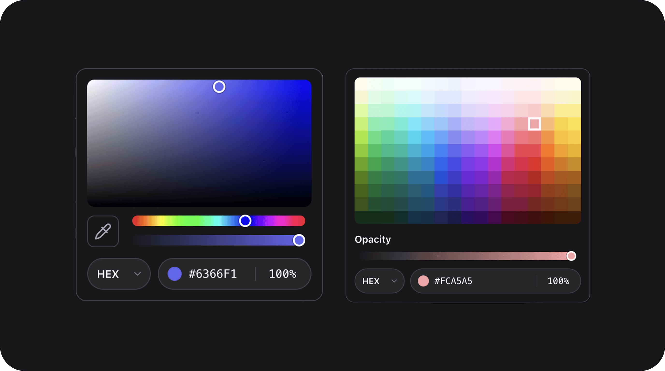
Full-featured color picker with advanced (HSV square + hue/alpha sliders + eyedropper) or grid (preset swatches) layouts. Output format is configurable as hex, rgb, hsl, or rgba.| Class | Bjanczak\FilamentFlexFields\Filament\Forms\Components\FlexColorPickerField |
| State type | string|null — color in the configured output format |
| FieldType | flex_color_picker |
Basic usage
State format
Stores a CSS color string in the format selected viahex(), rgb(), hsl(), or rgba() (default: hex). When alpha is disabled, rgba output falls back to rgb.
Configuration API
layout('advanced'|'grid')
Picker panel layout. Default: advanced.
hex() / rgb() / hsl() / rgba()
Shorthand for output format(). Default: hex.
format(string|Closure $format)
Explicit format: hex, rgb, hsl, or rgba.
alpha(bool|Closure $enabled = true)
Enable opacity slider and % input. Default: false.
eyedropper(bool|Closure $enabled = true)
Show browser EyeDropper button in advanced layout (when supported). Default: true.
gridColumns(int|Closure $columns) / gridRows(int|Closure $rows)
Generated palette size when gridColors() is not set. Defaults: 17 × 11 (Tailwind hue palette: lime → yellow, shades 50–950).
gridColors(array|Closure|null $colors)
Custom hex list for grid layout; when omitted, palette is generated from columns/rows.
variant(string|Closure $variant)
| Value | Description |
|---|---|
primary | Grey pill track. Default. |
secondary | Lighter background. |
flat | Transparent background and border. |
size(string|ControlSize|Closure $size)
sm, md, lg. Default: md.
Public helper methods
| Method | Description |
|---|---|
getLayout() | advanced or grid |
getVariant() | primary, secondary, or flat |
getFormat() | Resolved output format |
isAlphaEnabled() | Whether opacity controls are shown |
isEyedropperEnabled() | Whether eyedropper is configured |
getGridColumns() / getGridRows() | Grid dimensions |
getGridColors() | Custom grid palette or null |
isValidColorString(?string $value) | PHP-side color validation |
FlexField schema config
| Config key | Maps to |
|---|---|
layout | layout() |
format | format() |
alpha | alpha() |
eyedropper | eyedropper() |
grid_columns | gridColumns() |
grid_rows | gridRows() |
grid_colors | gridColors() |
variant | variant() |
size | size() |
CSS classes
| Class | Role |
|---|---|
fff-flex-color-picker | Root wrapper |
fff-flex-color-picker__shell | Trigger + panel container |
fff-flex-color-picker__trigger | Opens picker panel |
fff-flex-color-picker__preview | Color swatch in trigger |
fff-flex-color-picker__panel | Dropdown panel |
fff-flex-color-picker__saturation | S/V square (advanced) |
fff-flex-color-picker__eyedropper | Screen color picker button |
fff-flex-color-picker__hue | Hue slider |
fff-flex-color-picker__alpha | Opacity slider track |
fff-flex-color-picker__grid | Grid swatch container |
fff-flex-color-picker__bottom-bar | Format + value + opacity inputs |
Assets
Alpine component:flex-color-picker (resources/js/components/flex-color-picker.js).