Summary
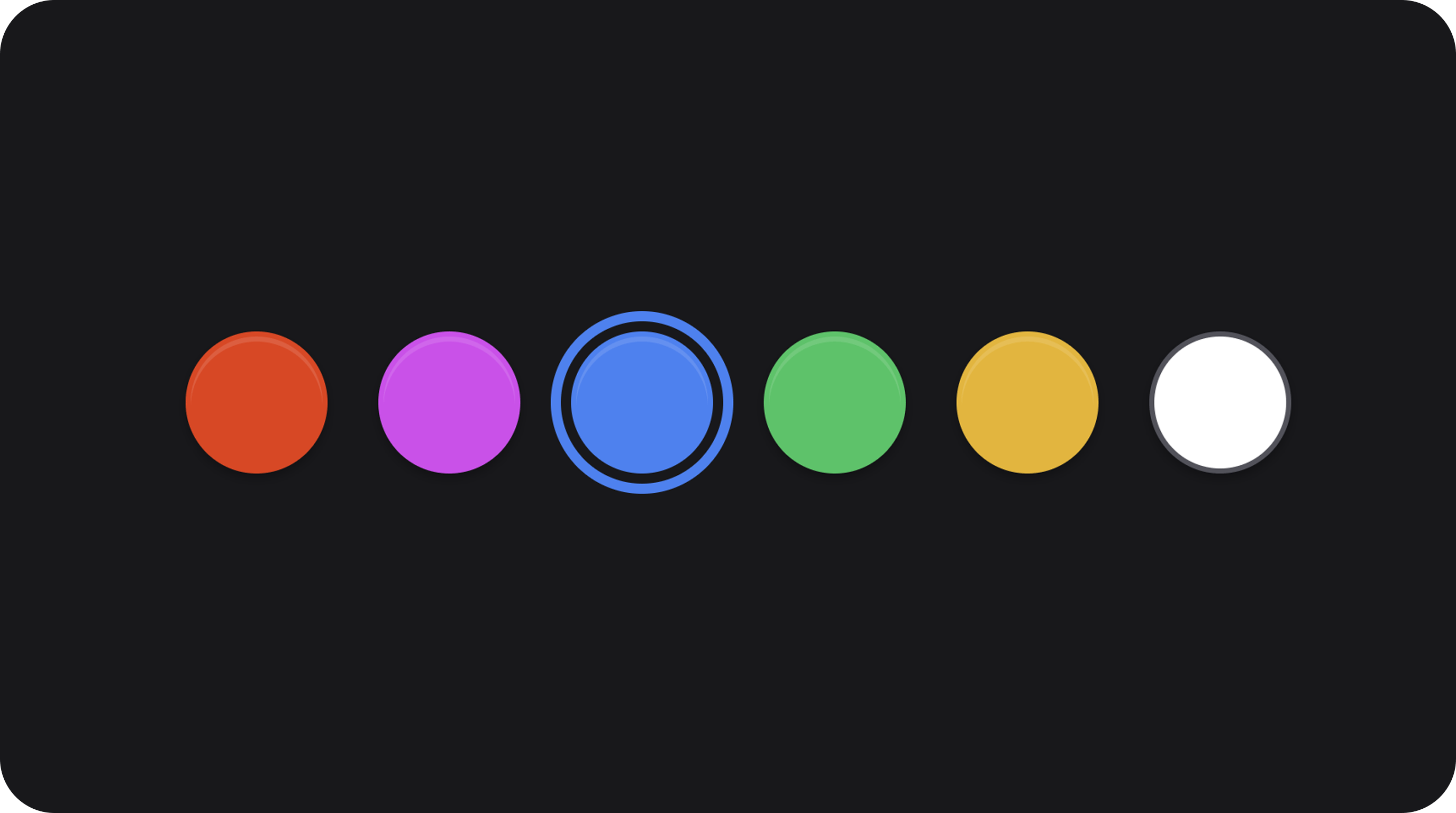
Preset color picker: horizontal swatch pills with optional section header and tooltips.| Class | Bjanczak\FilamentFlexFields\Filament\Forms\Components\ColorSwatchField |
| State type | string|null — selected color key (not hex) |
| FieldType | color_presets |
Basic usage
State format
Stores the array key fromcolors(), e.g. 'indigo', not #6366f1.
Validation
| Rule | Detail |
|---|---|
nullable | No selection allowed |
Rule::in(...) | Key must exist in colors() |
Configuration API
colors(array|Closure $colors)
Map of key => hex (or CSS color). Required for meaningful UI.
sectionLabel(string|Closure|null $label)
Optional heading above swatches.
sectionIcon(string|BackedEnum|Htmlable|Closure|null $icon)
Icon next to section label. When label is set and icon omitted, uses config color_swatch_section_icon or GravityIcon::Palette.
tooltips(bool|array|Closure $tooltips = true)
true = auto labels from keys; false = no tooltips; array = per-key labels.
size(string|ControlSize|Closure $size)
sm, md, lg. Default: md.
Public helper methods
| Method | Returns | Description |
|---|---|---|
getColors() | array<string, string> | Key → color map |
getSectionLabel() | string|null | Header text |
getSectionIcon() | string|BackedEnum|Htmlable|null | Header icon |
getDefaultSectionIcon() | string|BackedEnum|Htmlable | Fallback icon |
hasTooltips() | bool | Tooltips enabled |
getColorLabel(string $key) | string | Tooltip for key |
isLightSwatch(string $hex) | bool | Light swatch (border adjustment) |
FlexField schema config
| Config key | Maps to |
|---|---|
colors | colors() |
section_label | sectionLabel() |
section_icon | sectionIcon() |
size | size() |
tooltips | tooltips() |
CSS classes
| Class | Role |
|---|---|
fff-color-swatch | Root wrapper |
fff-color-swatch--{sm|md|lg} | Size modifier |
fff-color-swatch__pill | Swatch button |
fff-color-swatch__pill--light | Light color border |
fff-color-swatch__pill.is-selected | Selected state |
Implementation notes
- Keys are persisted; map to hex in your application layer or accessor.
isLightSwatch()detects white swatches for contrast borders.